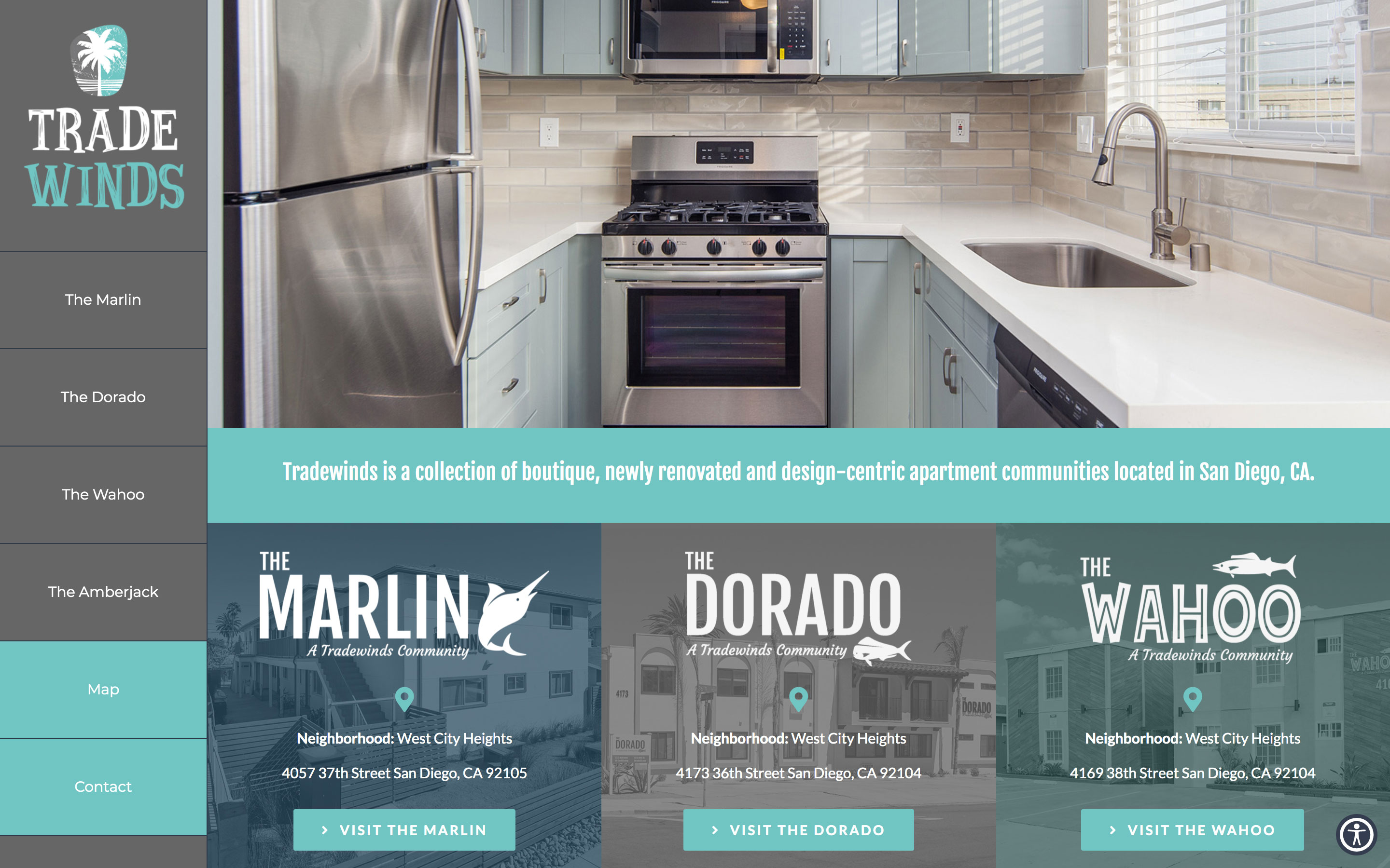
Tradewinds Living
A collection of newly rennovated apartment communities in the heart of San Diego. Features four distinct sites within the larger parent company.

A collection of newly rennovated apartment communities in the heart of San Diego. Features four distinct sites within the larger parent company.
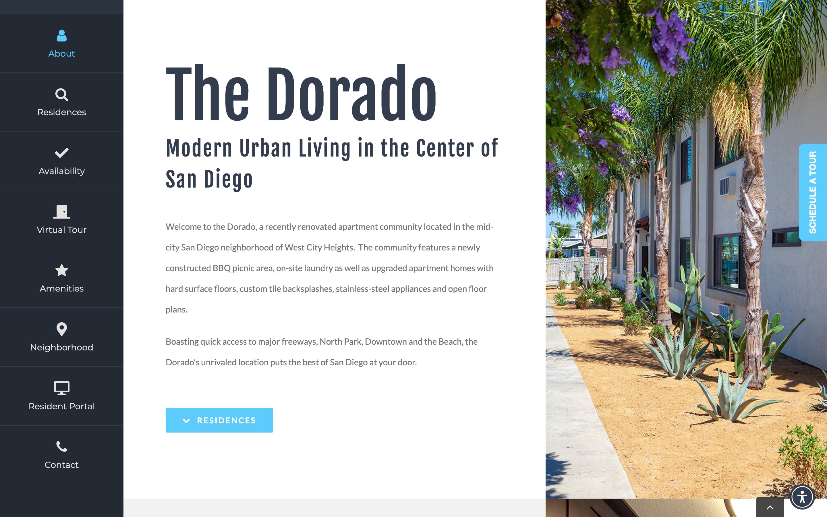
1. Dorado blue is featured in site navigation and in call to action buttons.
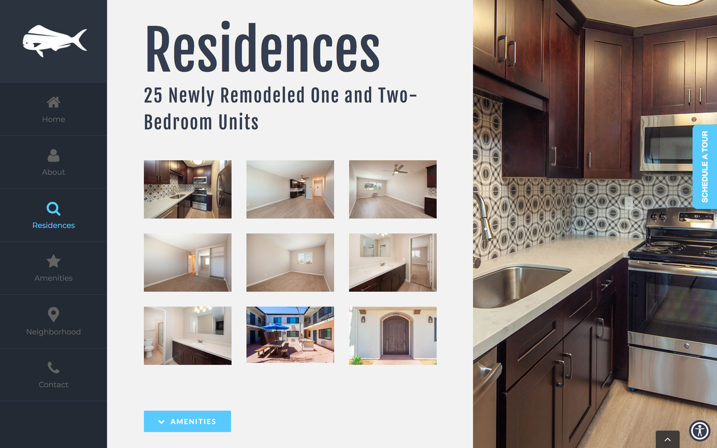
2. Following the same format as the other Dorado page, whole page images continue to be prominent features.
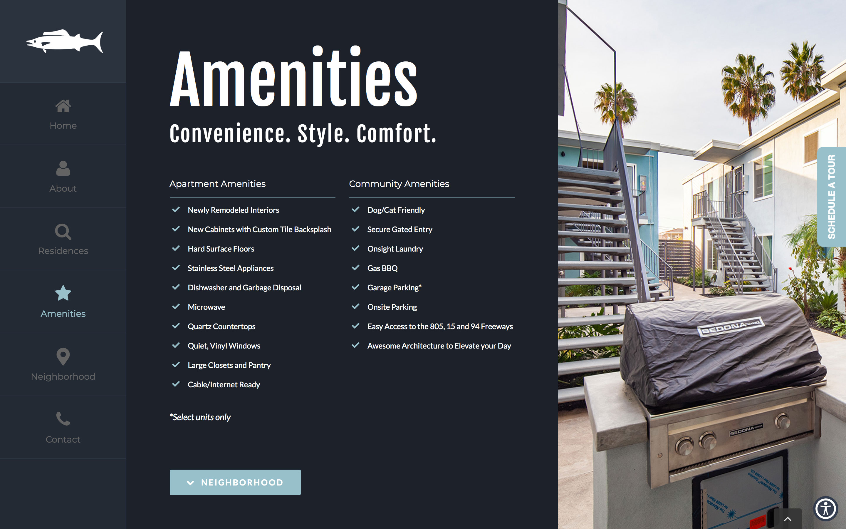
3. This page offers a bold contrast to the traditional black on white background.
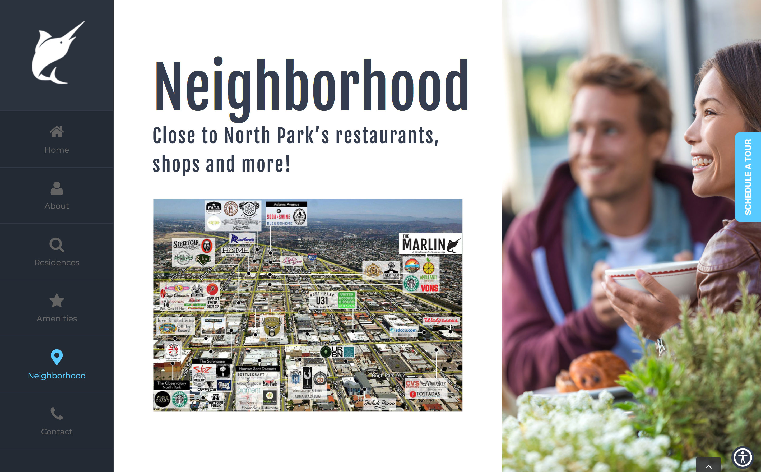
4. Shifting gears to the Marlin site, note a very similar style and template distinguished by the marlin fish icon.
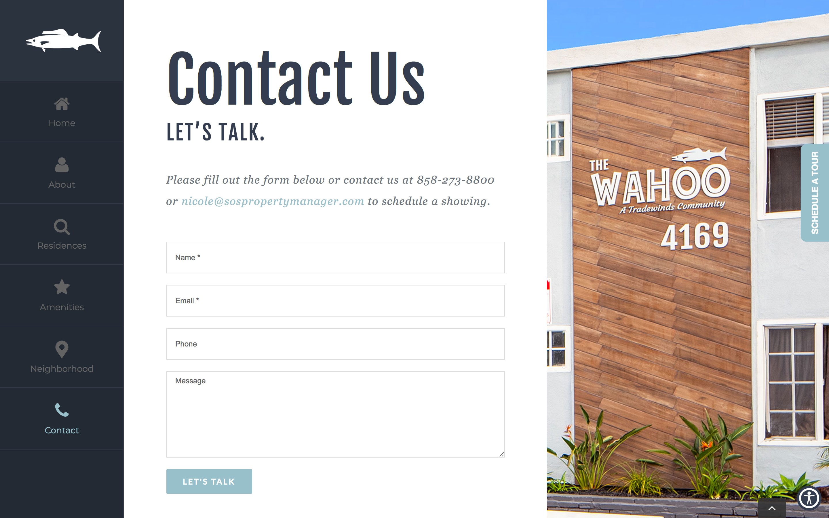
5. The wahoo fish displayed in the close-up building photo ties the theme together for this next child property feature.
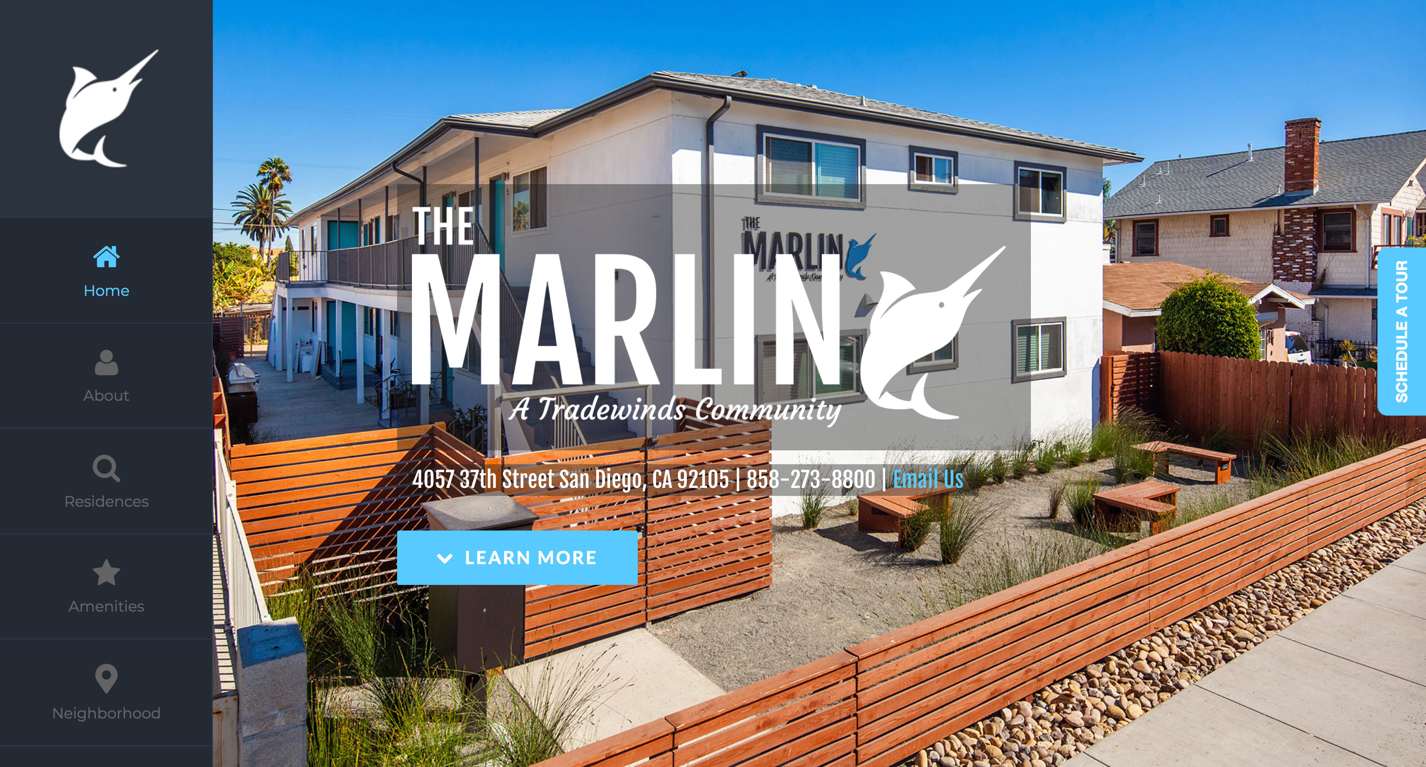
The Marlin landing page features a full-page photo, immersing customers in the experience of living in one of the apartment homes.
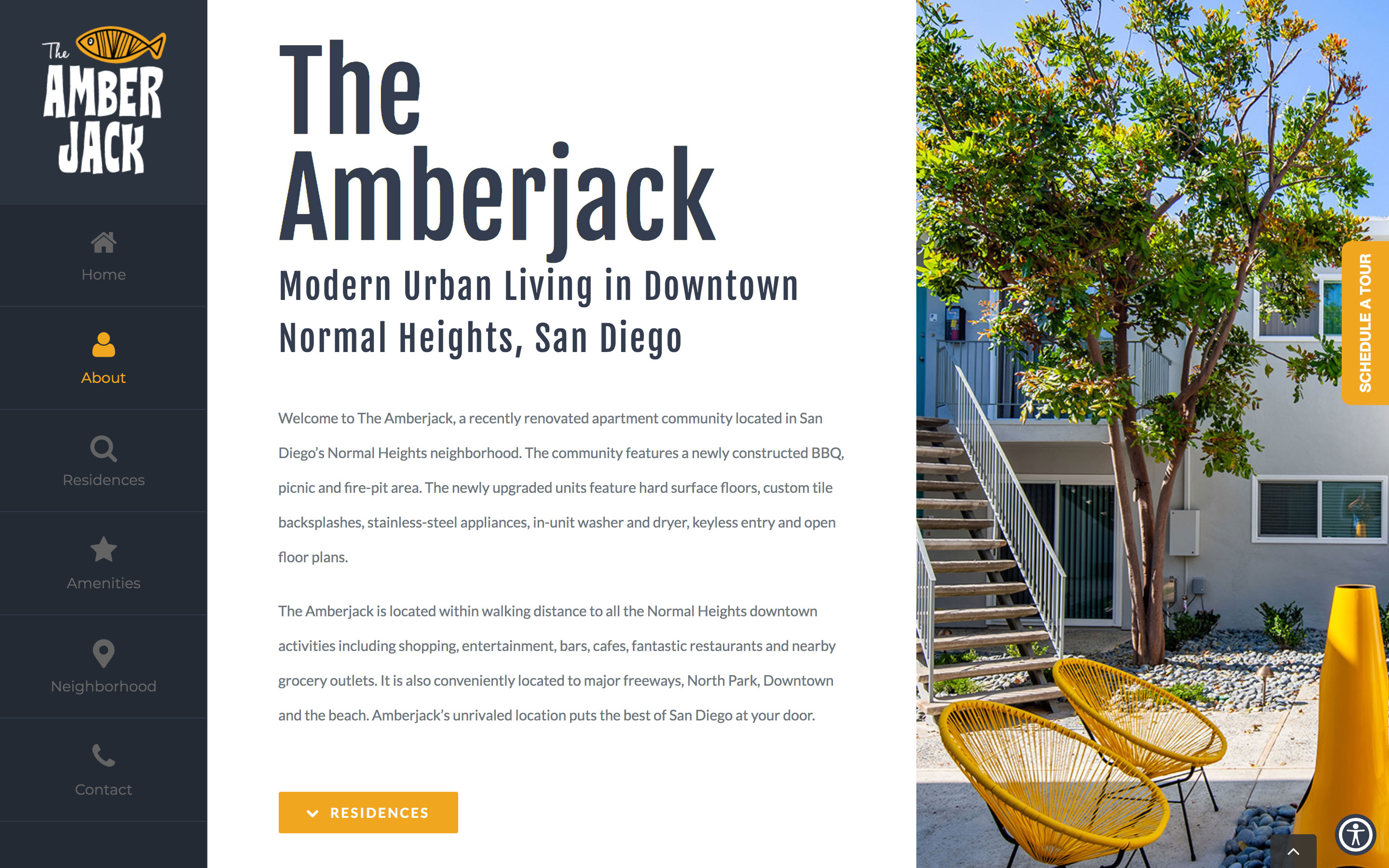
The yellow furniture featured in the photo complements the brand's accent colors, creating a cohesive visual identity.
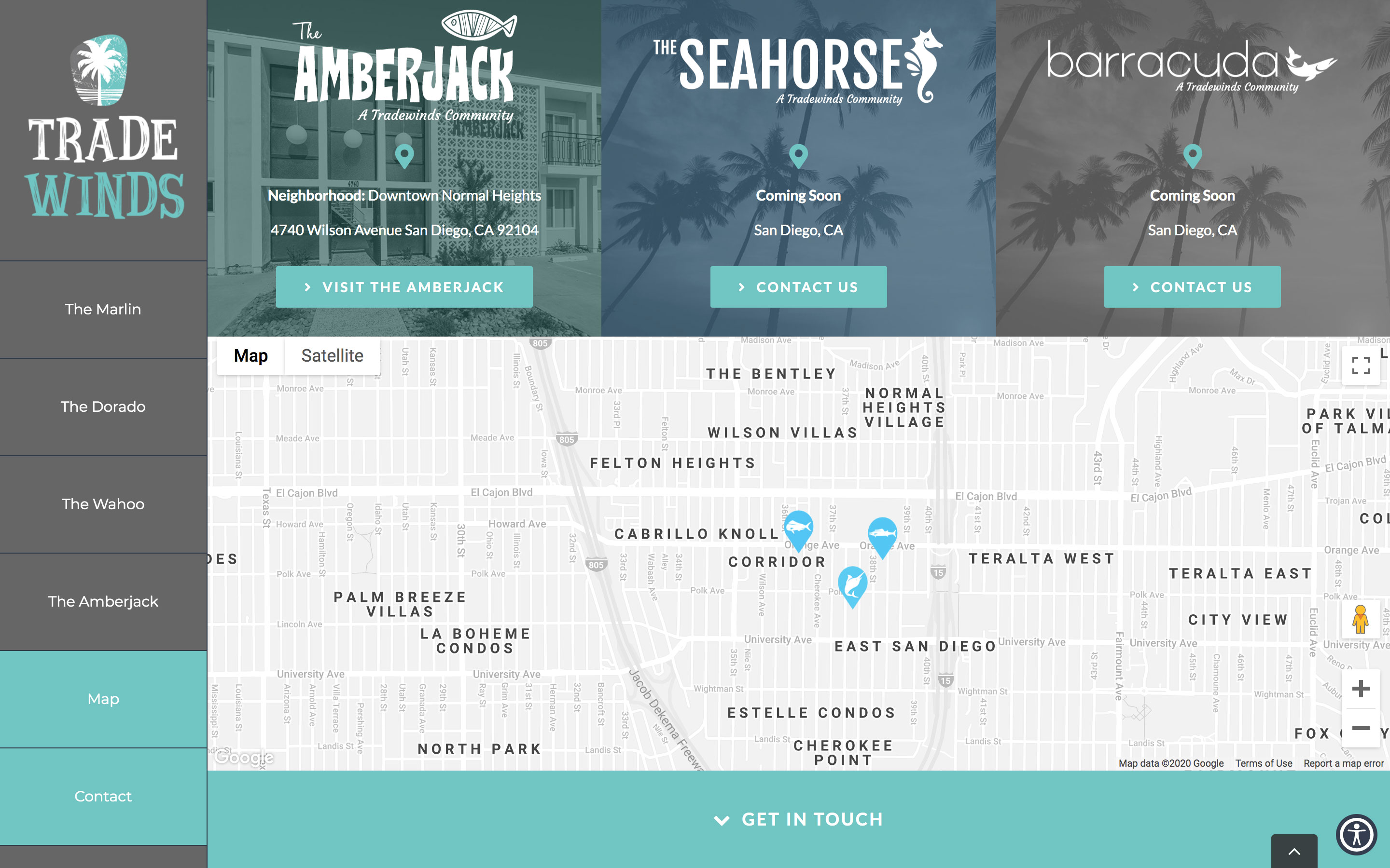
The Tradewinds Living website seamlessly connects all communities and offers navigation with a full-view map to accompanying partner sites.