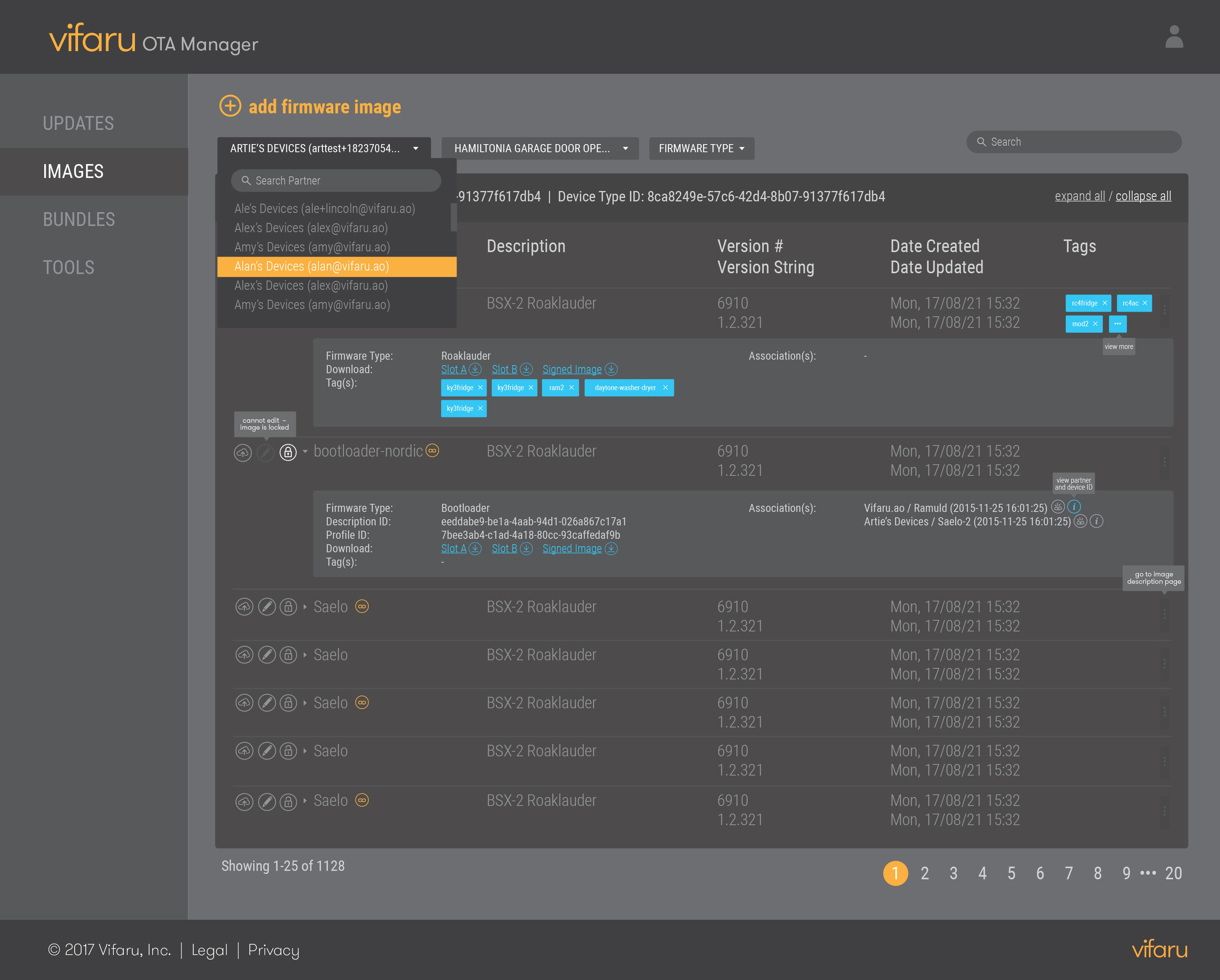
OTA Manager Dashboard
Management tool used to create firmware images/bundles and push updates across client devices. I provided an intuitive interface for controlling the OTA process.

Management tool used to create firmware images/bundles and push updates across client devices. I provided an intuitive interface for controlling the OTA process.
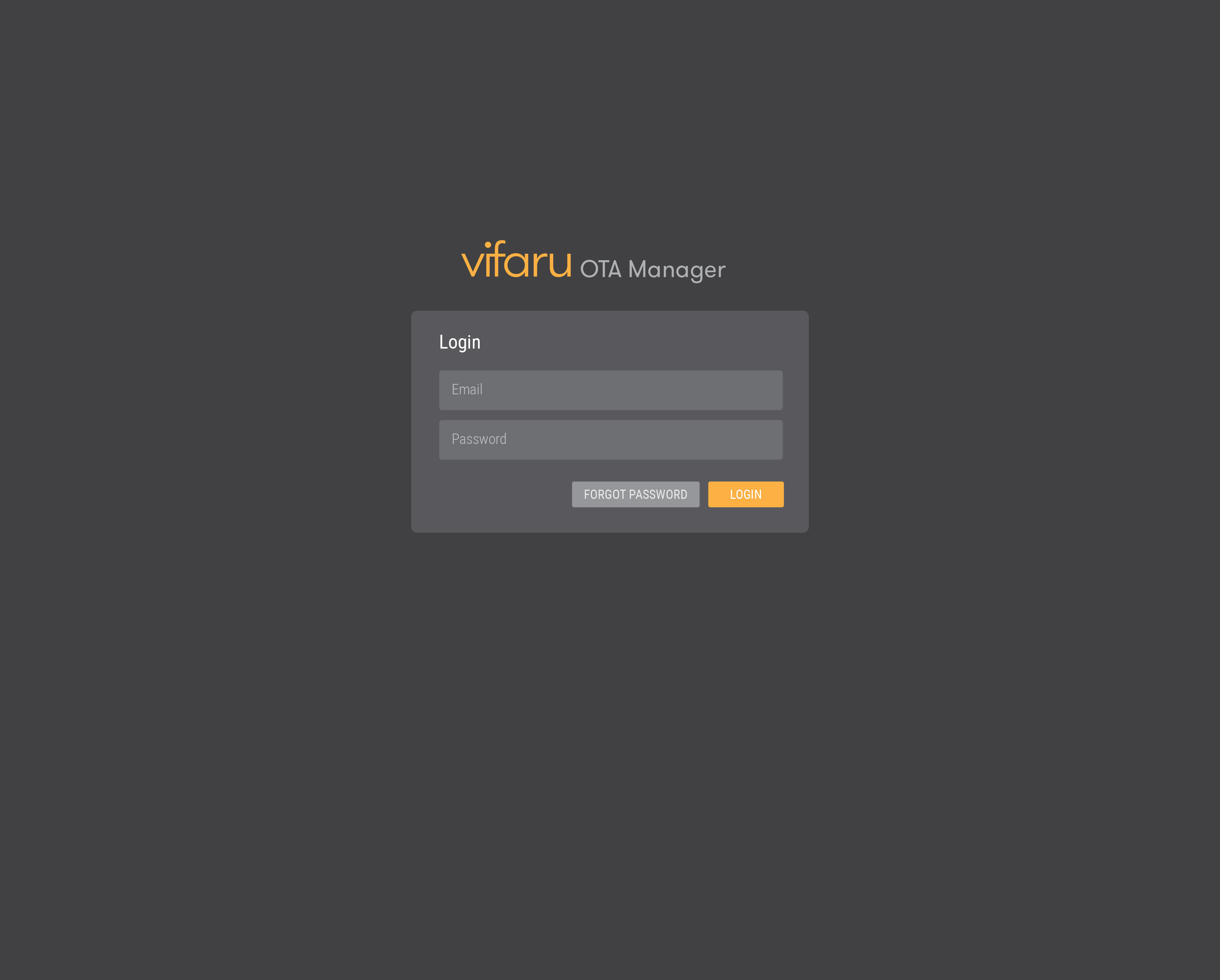
1. Login screen uses a dark base for better readability and brand colors for highlighting.
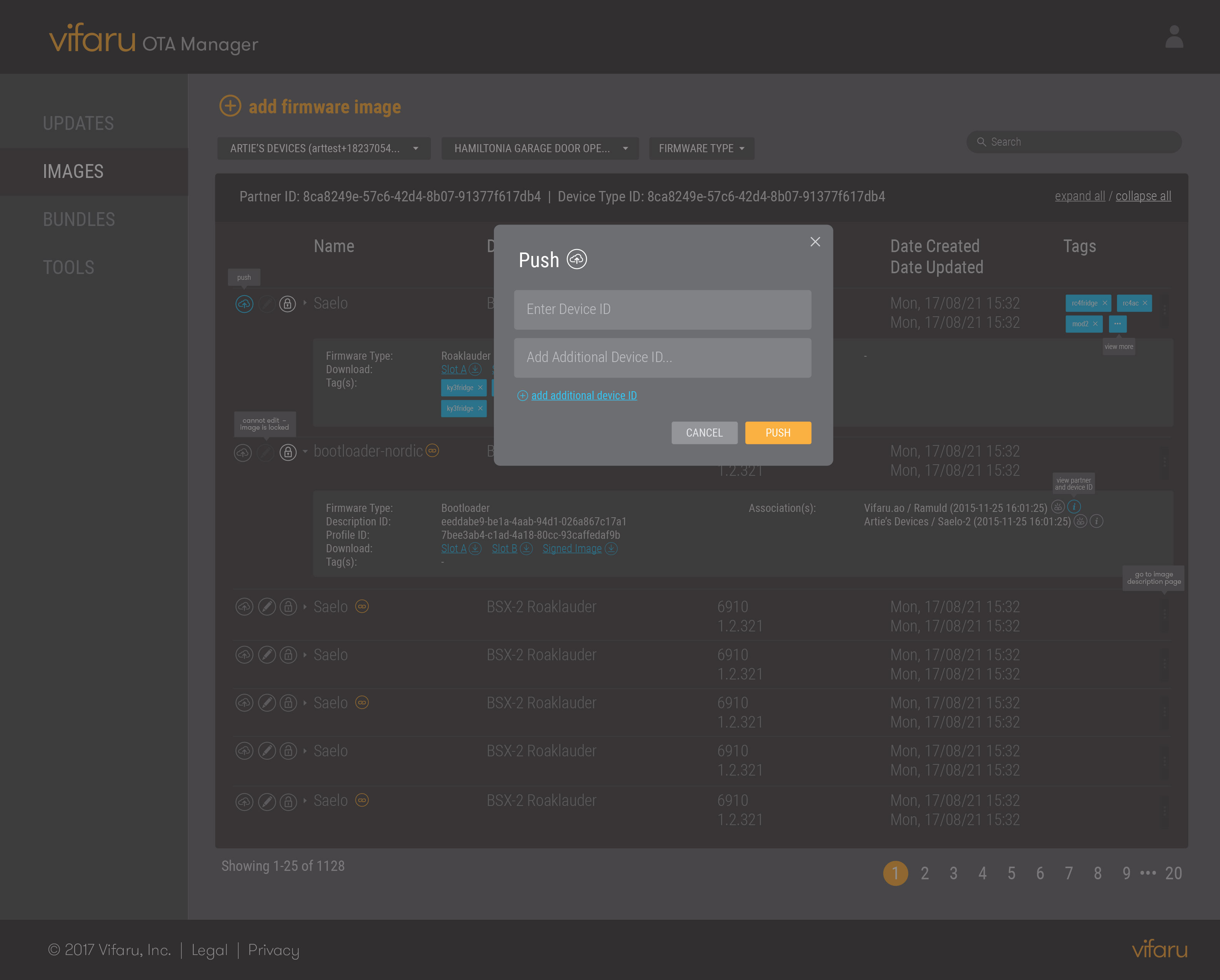
2. Modal that appears when "Push Update" button is pressed from the "Images" dashboard.
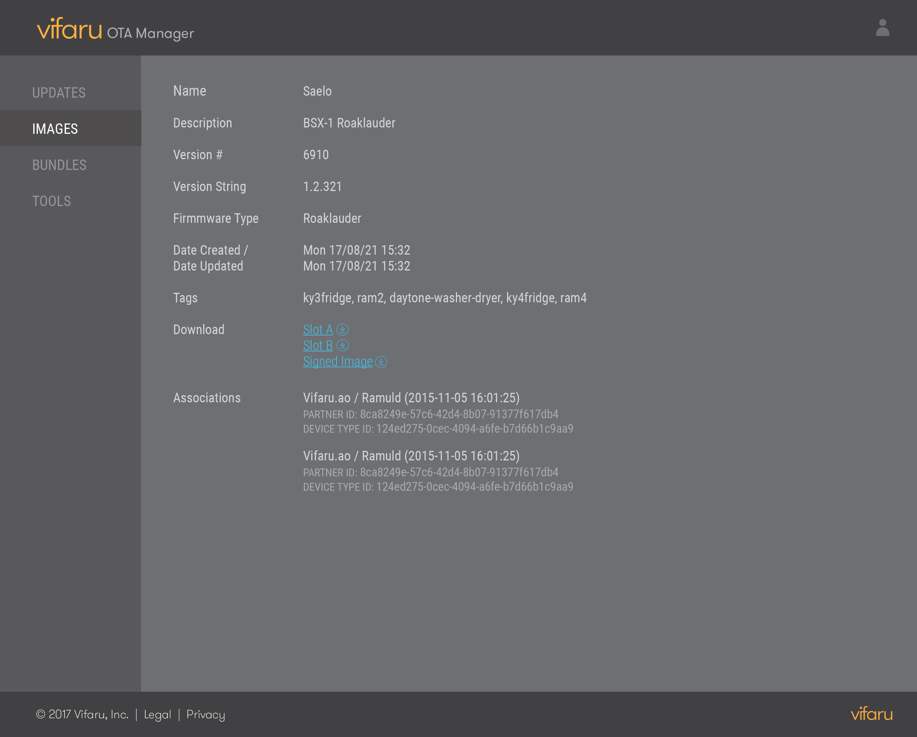
3. Specific image detailed dive in. This offers an alternative view to the table display for those who prefer a linear format.
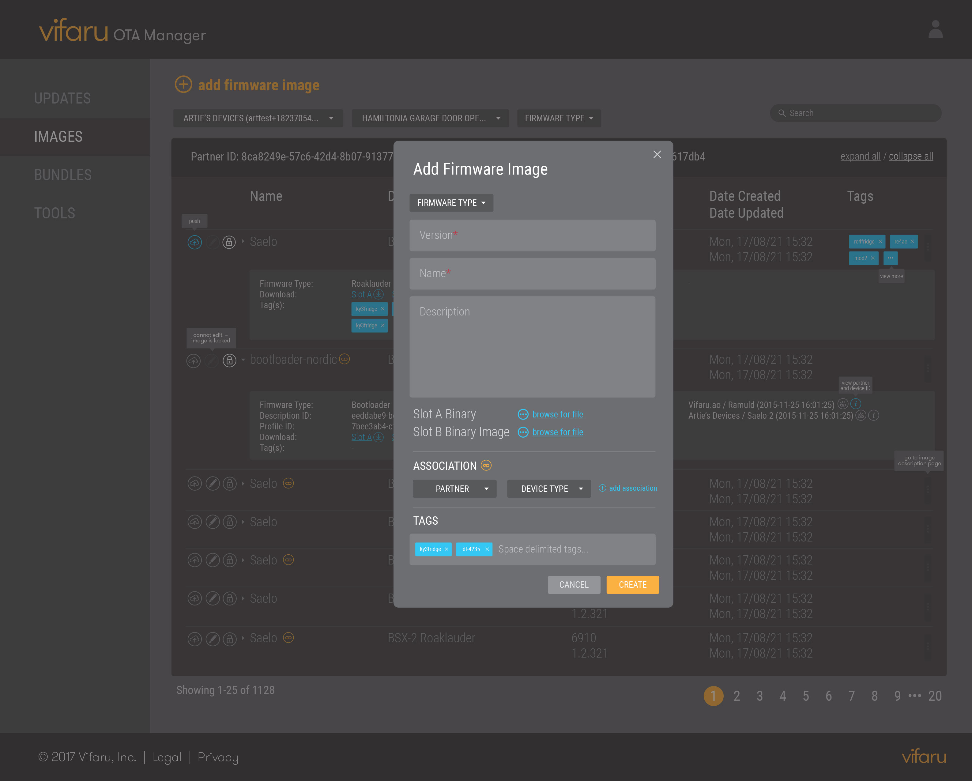
4. "Add firmware image" setup only requires two pieces of information. Other inputs can be added concurrently through this modal or later in the dashboard.
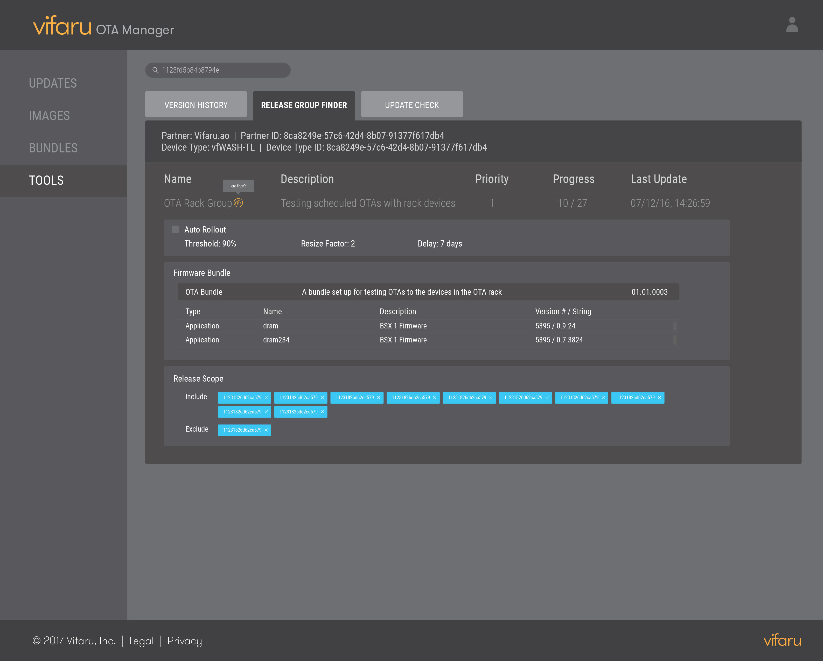
5. Tabular design with selection on Release Group Finder, which is further subdivided into three modules.
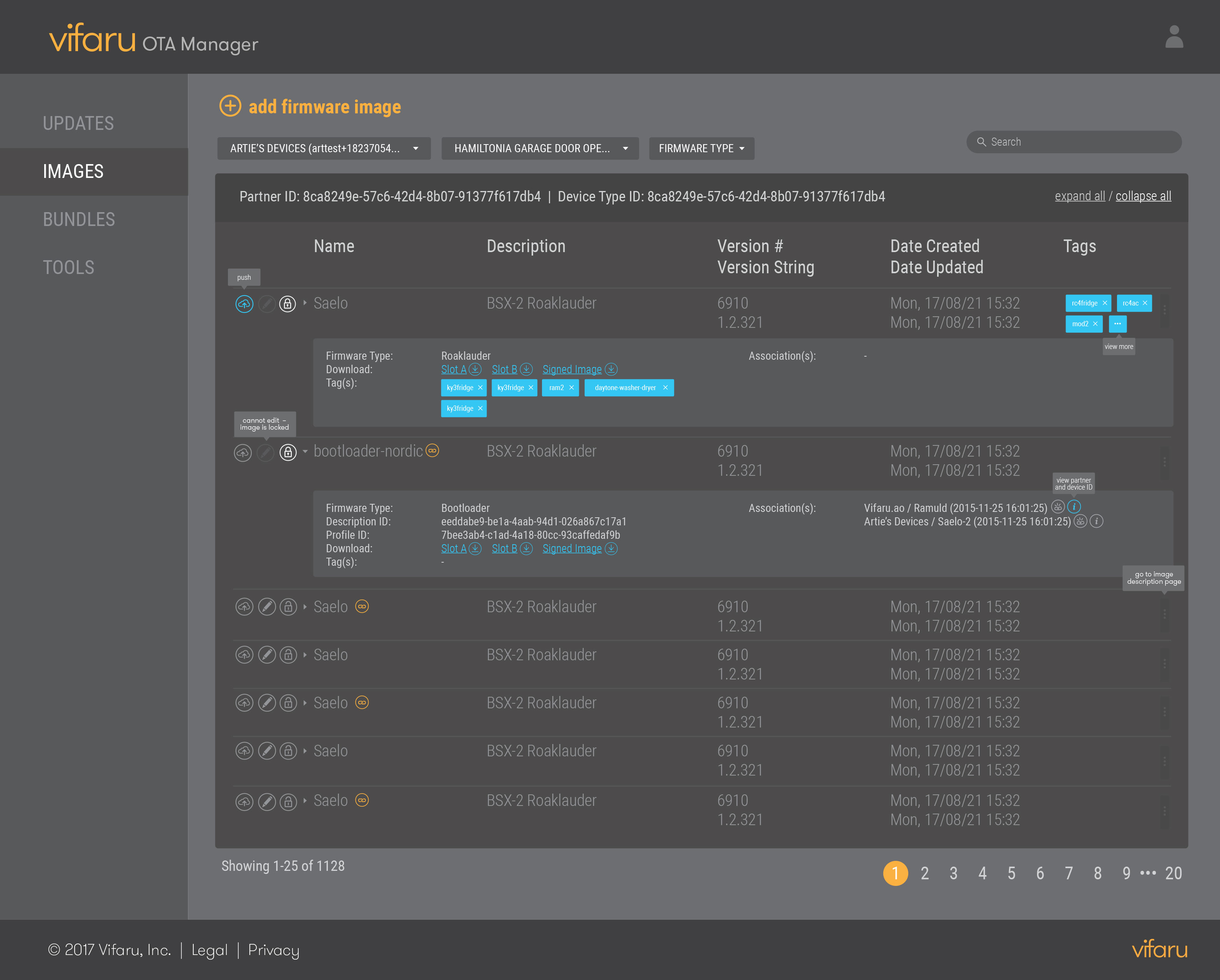
Data about firmware type, tags, and downloaded links is revealed progressively in collapsible panels. Further options to push, edit, and lock images are available in single click buttons.
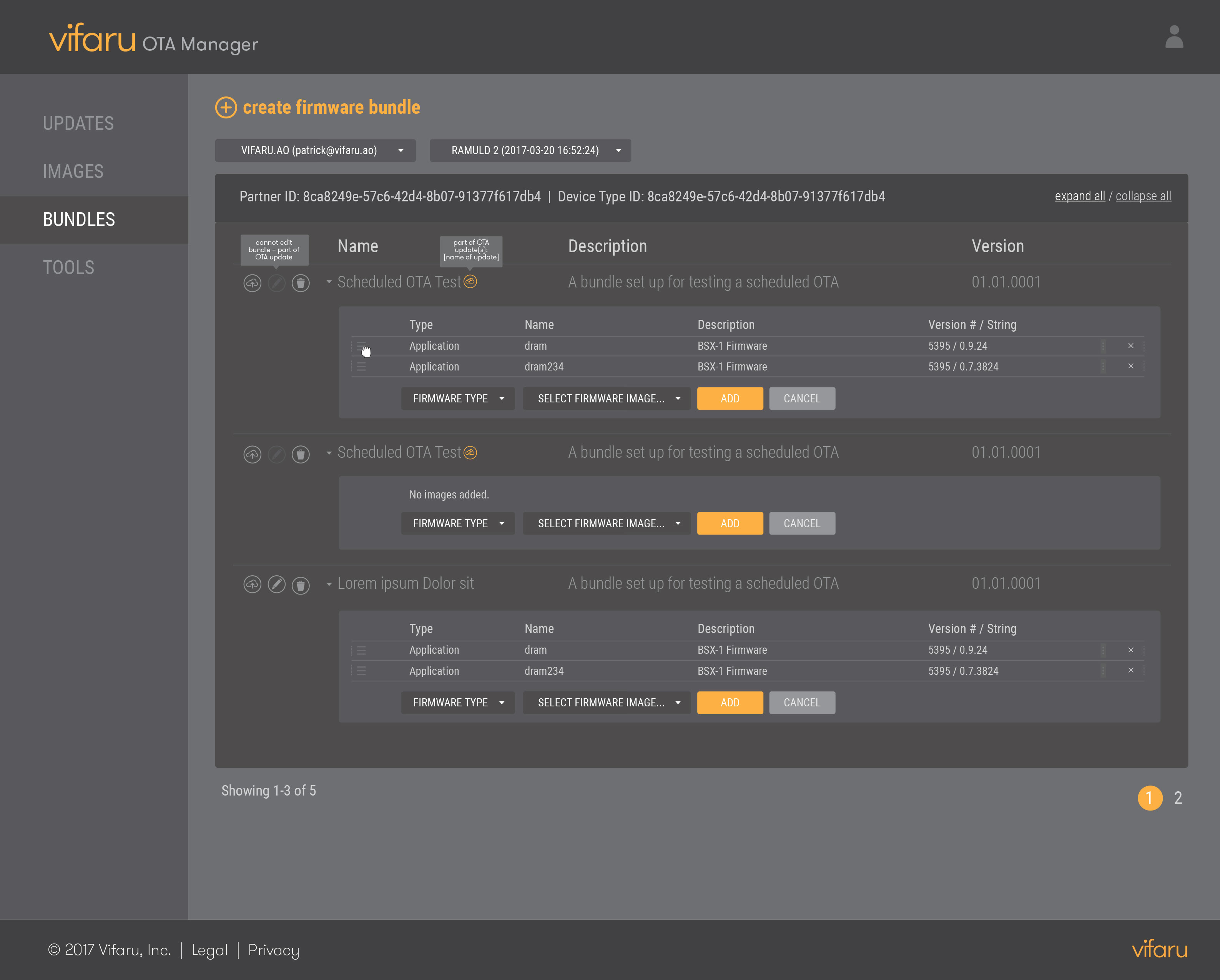
Users are already familiar with the tabular and collapsible format of the Images screen, so the Bundles variation builds upon that model, using brand colors to highlight actionable items.
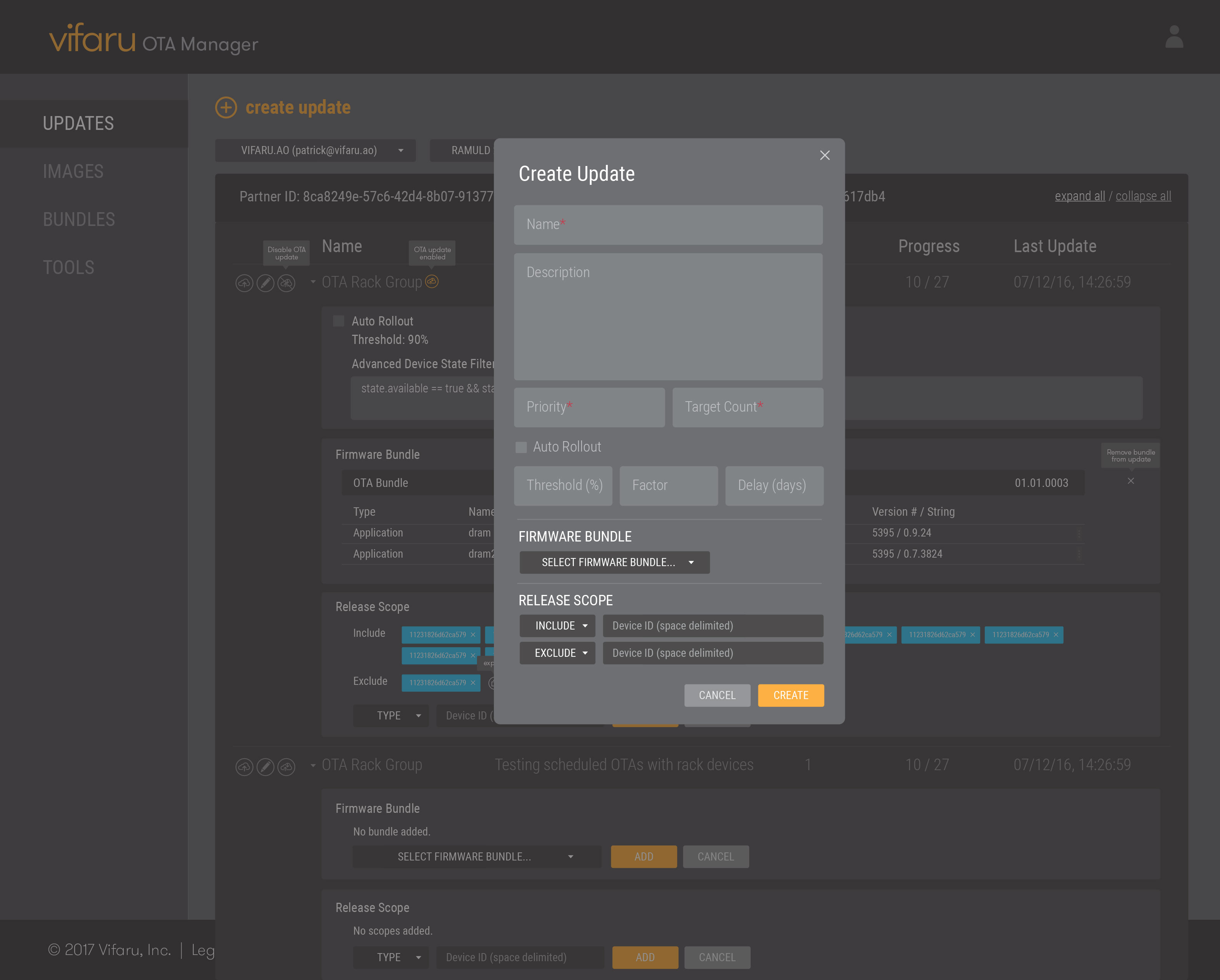
The update creation process is intuitive and a quick flow for the user. Sections and mandatory fields are easily distinguishable.