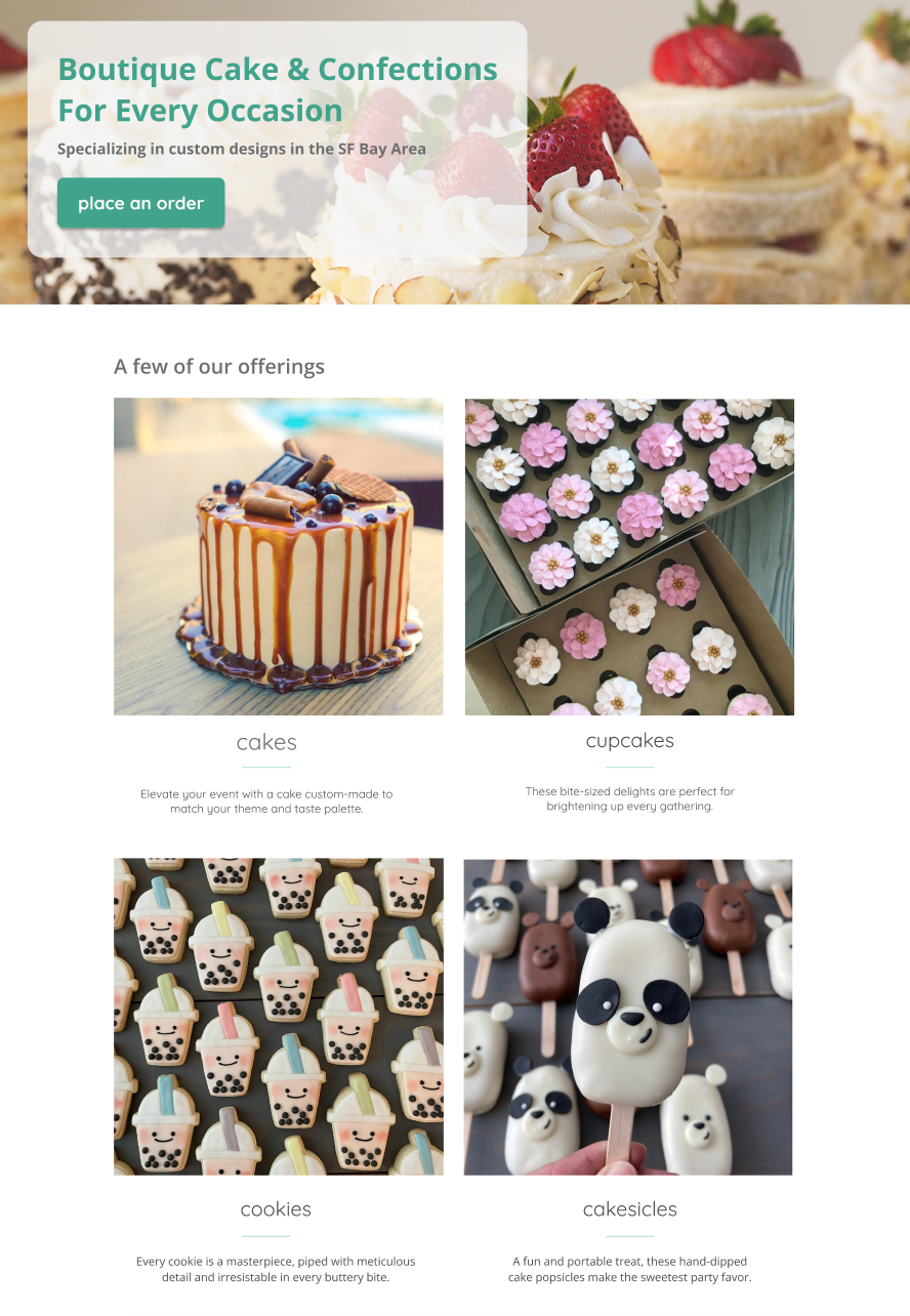
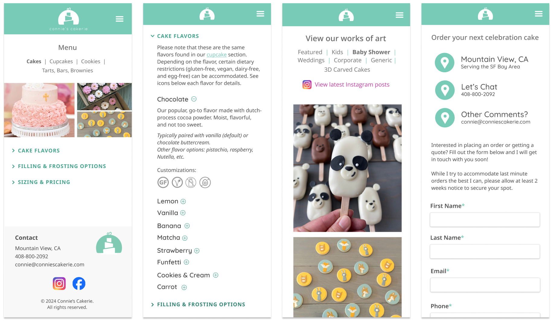
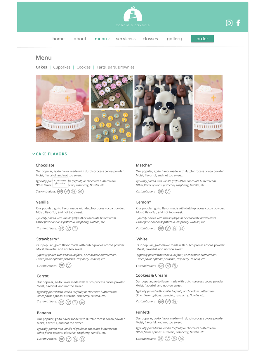
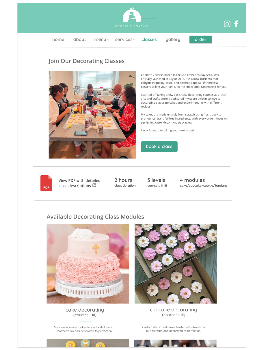
By grounding the design in clear goals, competitor insights, and user research, I was able to ensure
a website experience that aligns with user needs.
STEP 1: UX RESEARCH & DESIGN
Who are the Users?
What are the pain points? What is the end goal? Who are the key
competitors, both within the industry and in adjacent markets? These were some of the
questions I asked as I began drafting the initial concepts for the website. Exploring these foundational
elements provided a clearer direction and helped ground the project's objectives.
From there, I started laying the groundwork for the site’s overall design, incorporating insights from
user research to ensure each decision aligned with real user needs and expectations.
USER RESEARCH
As with any project, the initial user research is critical to understanding the end user. I identified
the pain points and common goals of customers who would potentially visit this bakery website.
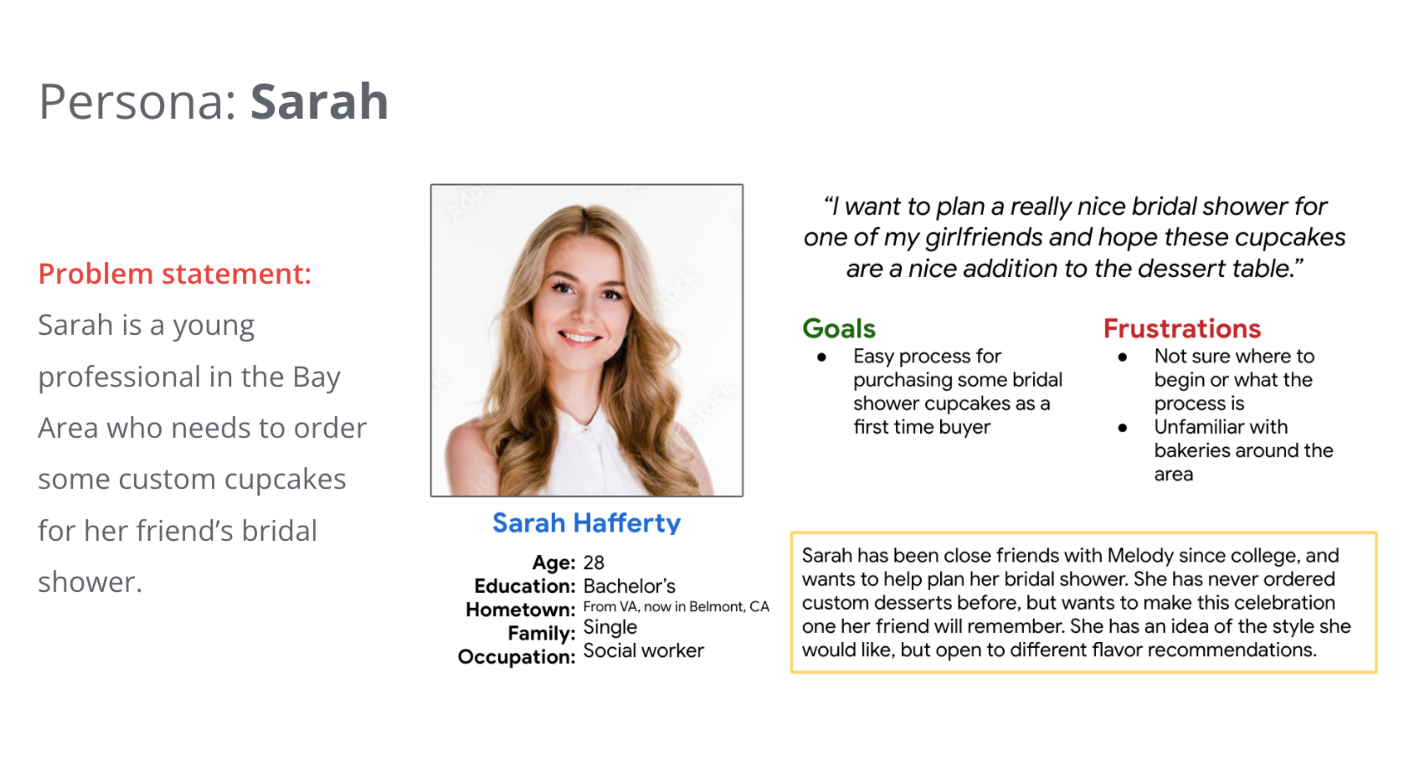
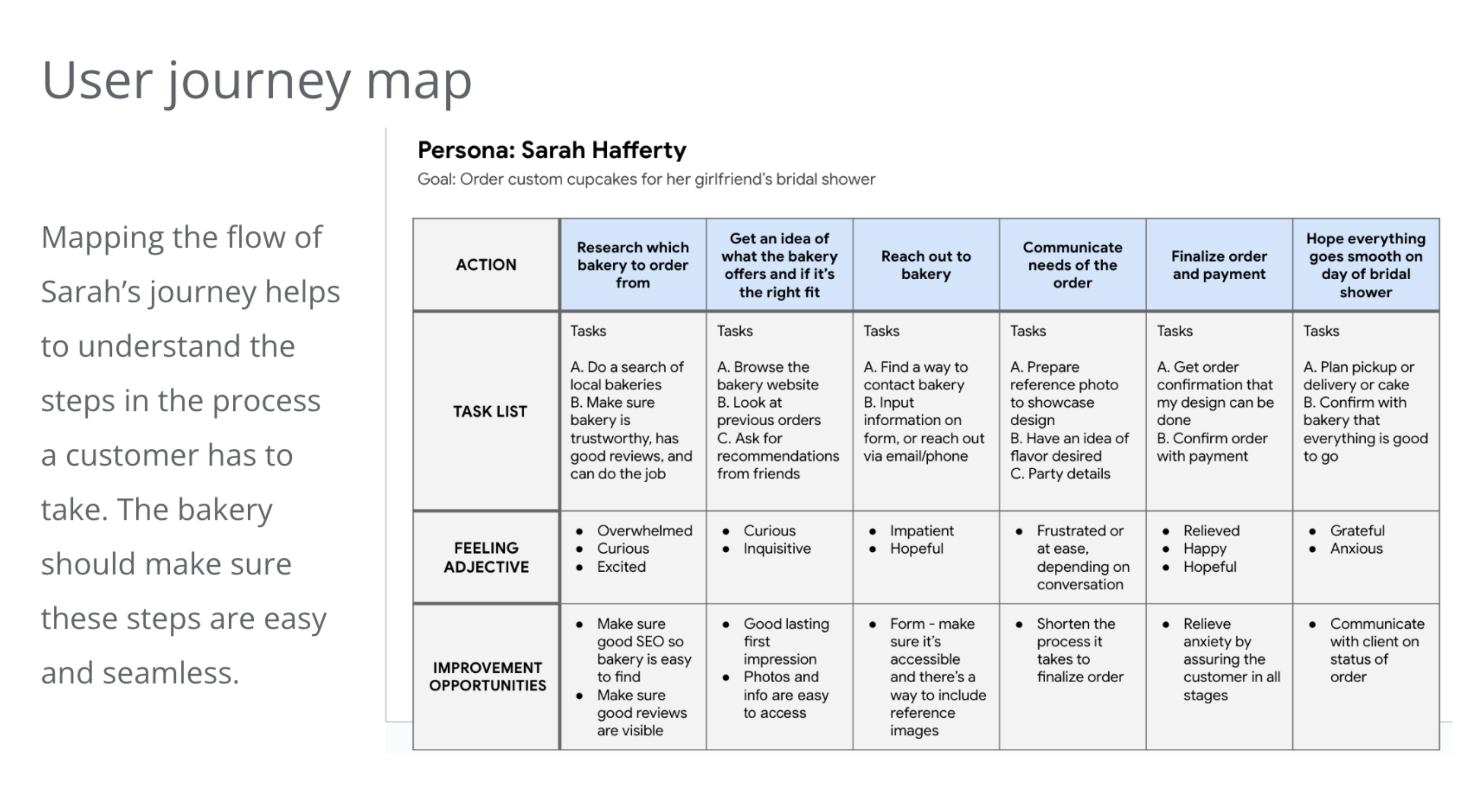
USER PERSONAS + JOURNEYS
Crafting user personas and journey maps helped me outline key steps a customer takes while navigating a
website. This insight enabled me to make more informed design decisions for each page.
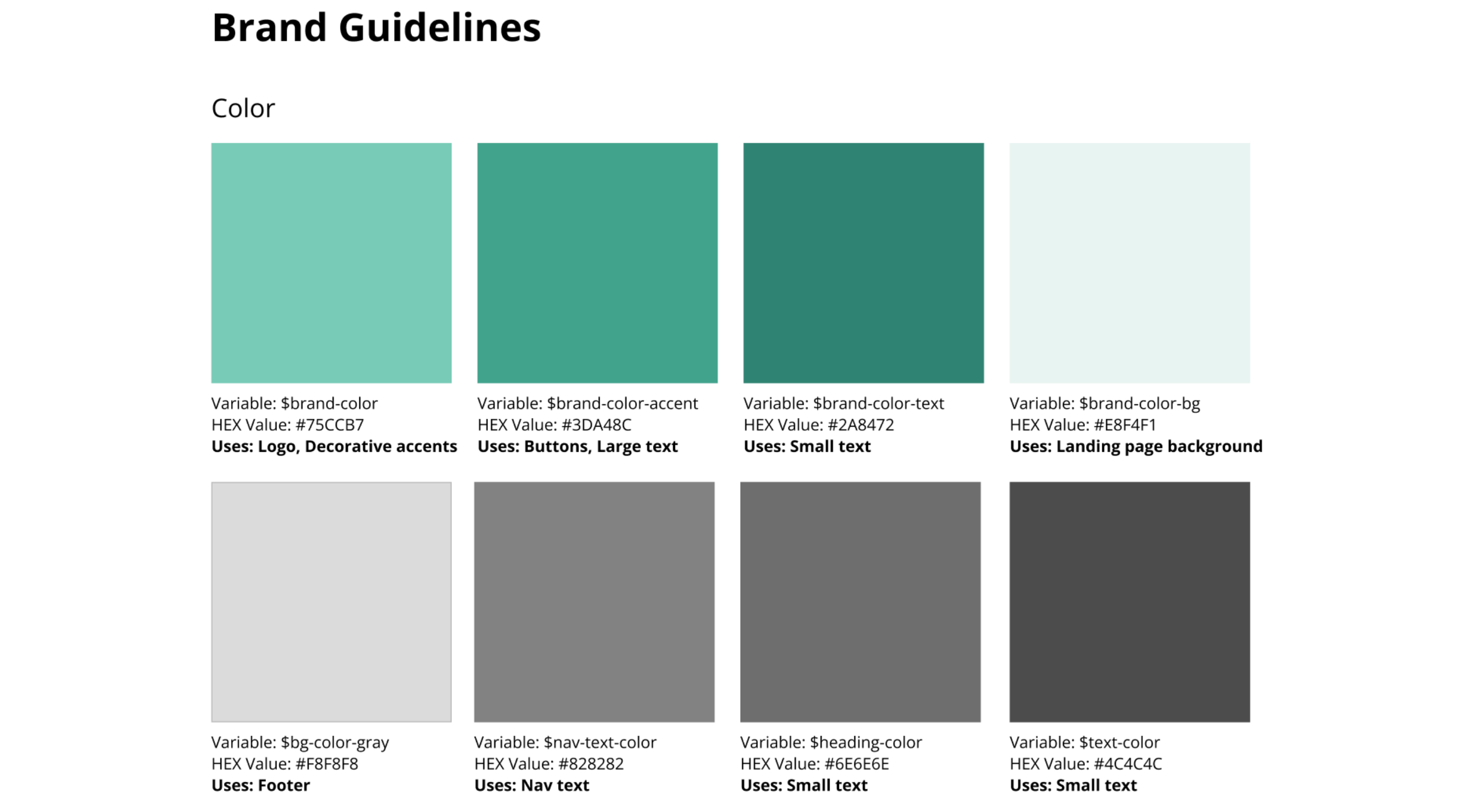
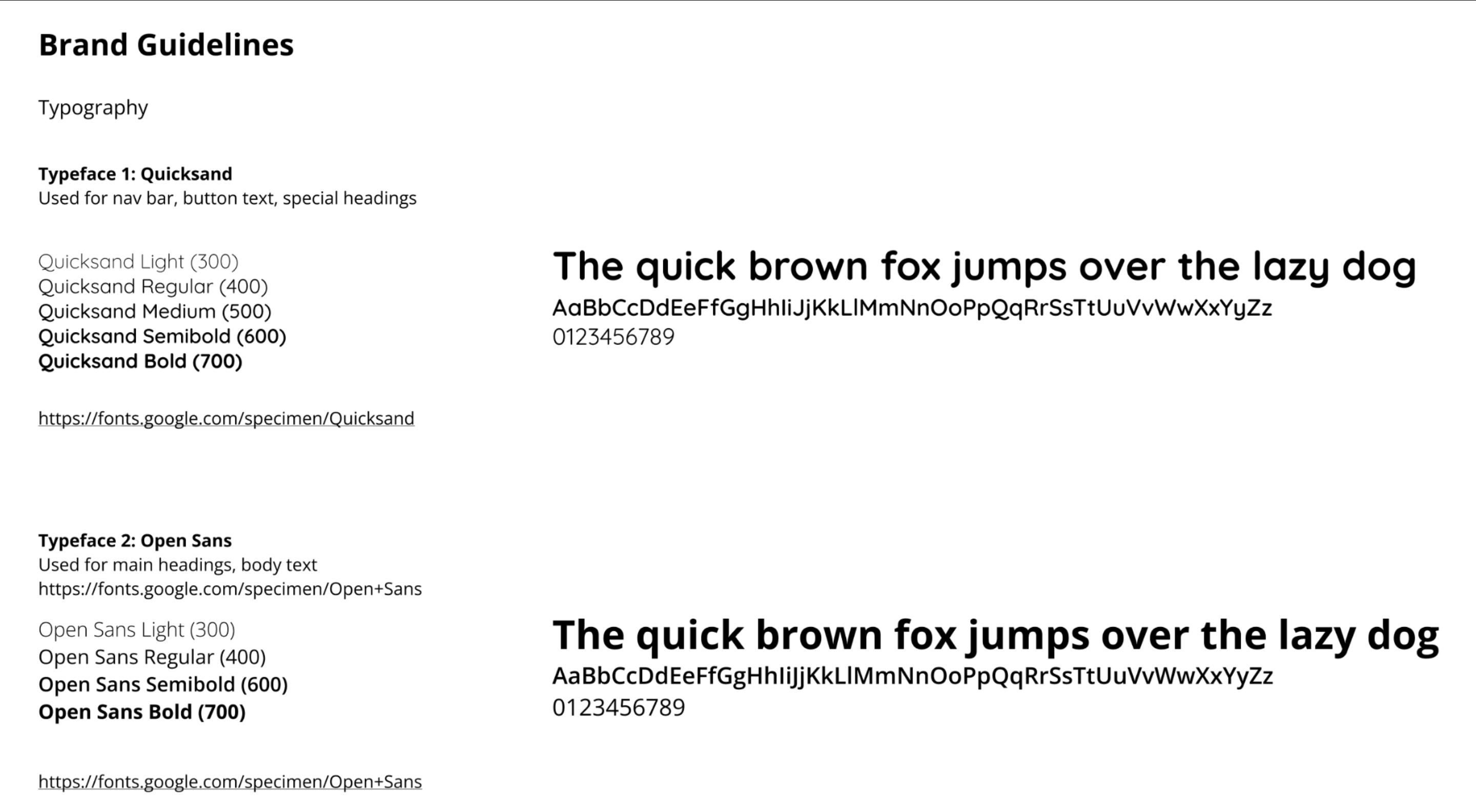
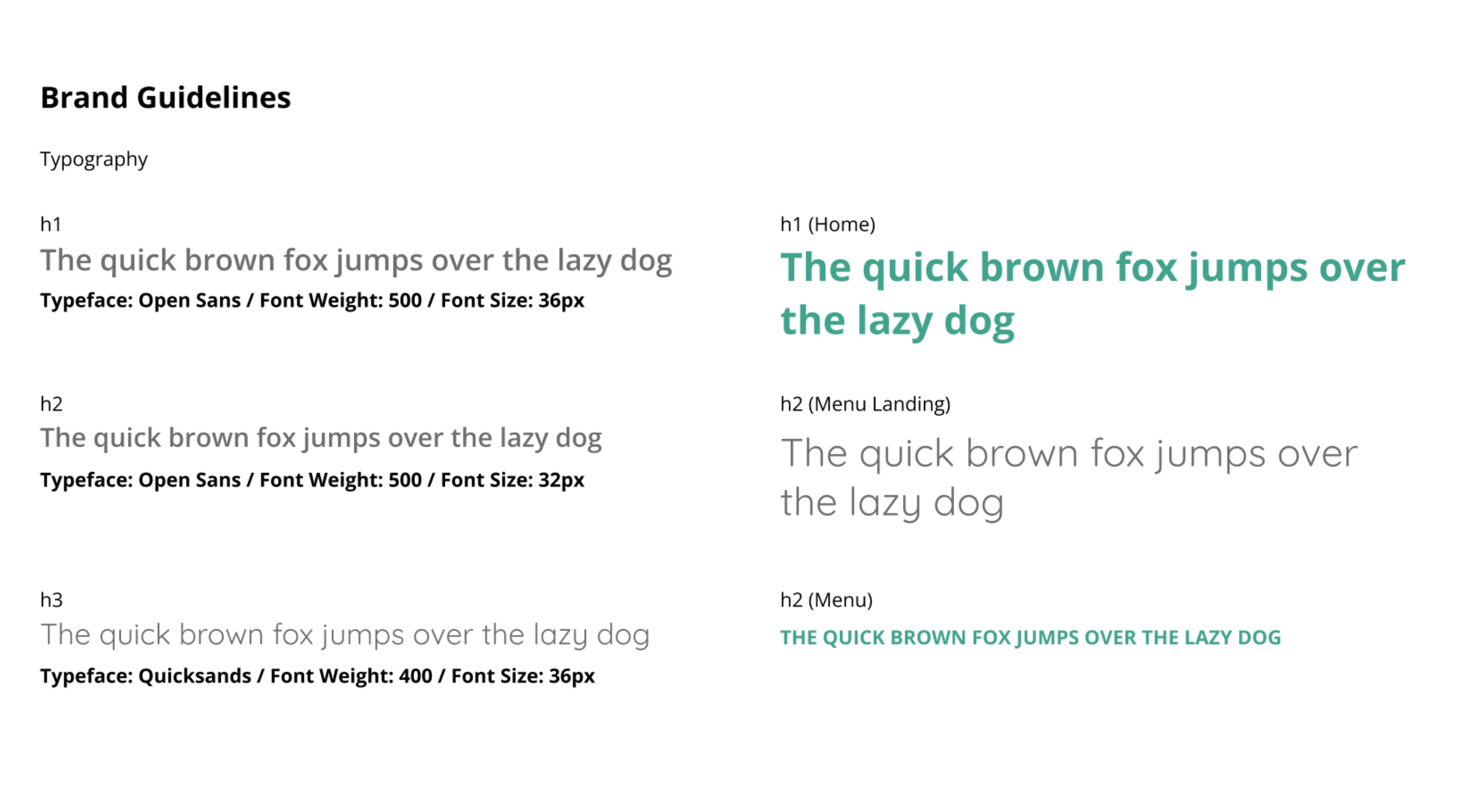
BRAND GUIDELINES
Colors, typography, and component elements are carefully planned in this section, each with a defined
purpose and specific use.
INFORMATION ARCHITECTURE
I didn't want to overpopulate the main nav with too many items, so I included a Services tab to
encompass a few connected pages, as well as a new FAQs page linked to from the Orders page and Quick
Links.
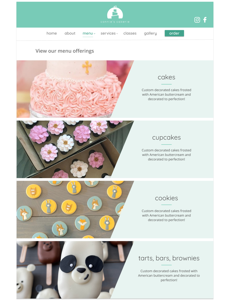
LO-Hi FIDELITY MOCKS
I began with pen-and-paper wireframes before moving to Figma for the hi-fidelity versions. For the logo
and custom iconography, I used Adobe Illustrator to ensure a unique and polished visual identity.
USER STUDIES
I conducted multiple design iterations with focus groups and both informal and formal 1:1 sessions with
users. This process provided valuable insights into user behavior and website navigation patterns.
Thoughtful engineering transforms concepts into reality.
STEP 2: ENGINEERING
Reusable, Scalable Components
Creating this site involved careful consideration of code structure and efficiency. I focused on
writing reusable, digestible React components that enhance maintainability and scalability. Thoughtful
CSS was utilized with SASS variables and mixins. I also leveraged proper React hooks to manage state and
side effects effectively.
ACCESSIBILITY
A11y was a priority, ensuring not only color contrast compliance but also full usability
with screen readers and keyboard navigation through proper ARIA labels and image alts.
INTERACTIVITY
By adding subtle CSS hover and transition effects, I'm able to present a delightful user experience as
the customer navigates across the menu bar and social media icons.
CODE STRUCTURE
I implemented a clear folder structure with dedicated directories for assets,
components, pages, and styles. Each component is also linked with its own SCSS file.
SVG ASSETS
Instead of importing multiple SVG files, I chose to combine them into one Icons.tsx file with an
IconProps type to extend accessibility attributes with
...props.
RESPONSIVENESS
To ensure a seamless exprience across devices, I implemented media queries across breakpoints and used
flexible units like percentages and rem for scalable elements.
INTEGRATION WITH APIs & NPM
Data is retrieved from the Google Sheets API to populate available classes in the React Calendar. Once a
booking is made, the data is then posted back to Google Sheets.
Project Takeaways / Impact ✨
This project underscored the value of streamlined content and accessible design, showcasing how well-crafted
digital experiences can drive both user empowerment and satisfaction.
I enhanced the clarity and wealth of website content, empowering users to make more informed decisions.
By designing an engaging and pleasant experience across platforms, I ensured a consistent and enjoyable
journey for users across mobile and desktop devices. The emphasis on accessibility made the content more
inclusive, while thoughtful optimizations improved time efficiency both for the business owner and customers
with the integration of the calendar booking system.
« View other selected works
