Daytone Pay Dashboard
Designed a dashboard for laundromat owners to associate new devices, track earnings, and view statistics on each device.

Designed a dashboard for laundromat owners to associate new devices, track earnings, and view statistics on each device.
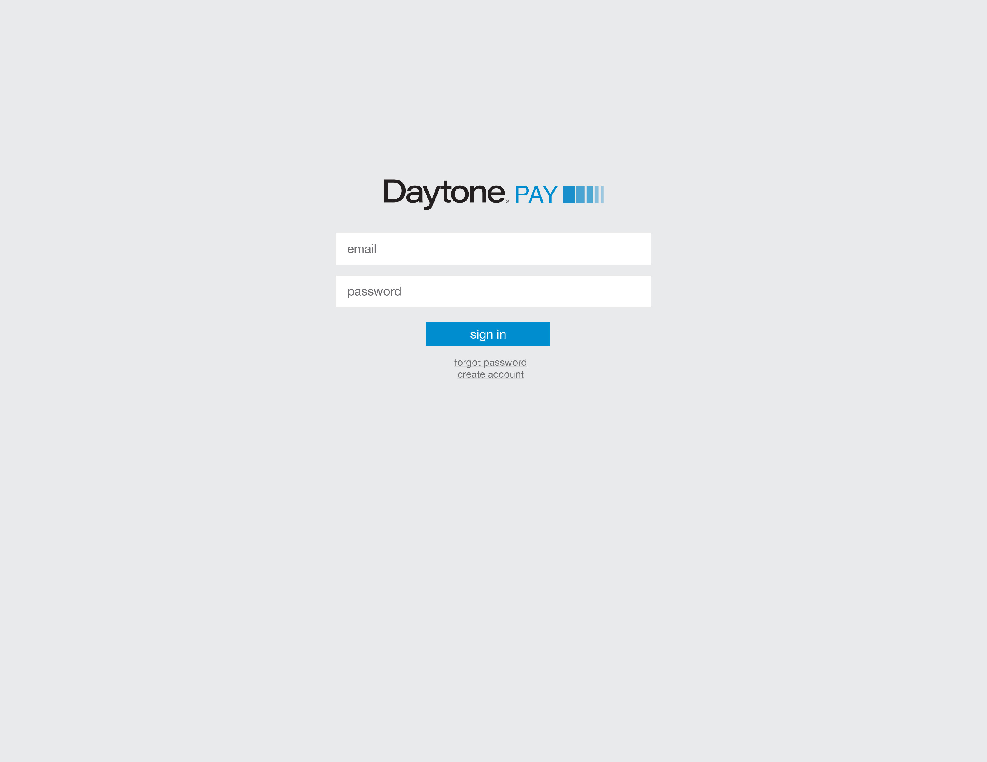
1. Daytone Pay login screen introduces users to the platform.
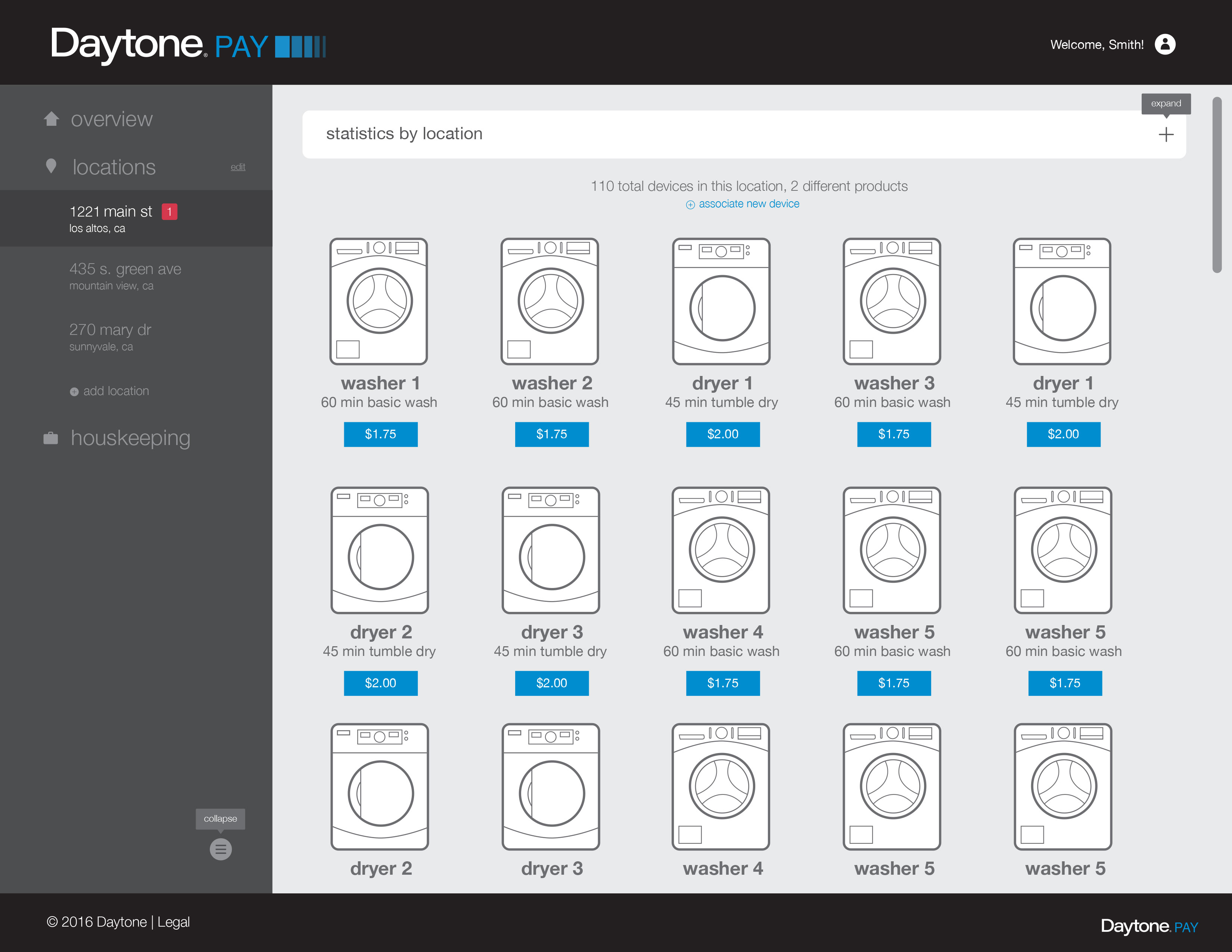
2. In the main dashboard, users see an overview of their washing machine devices per location.
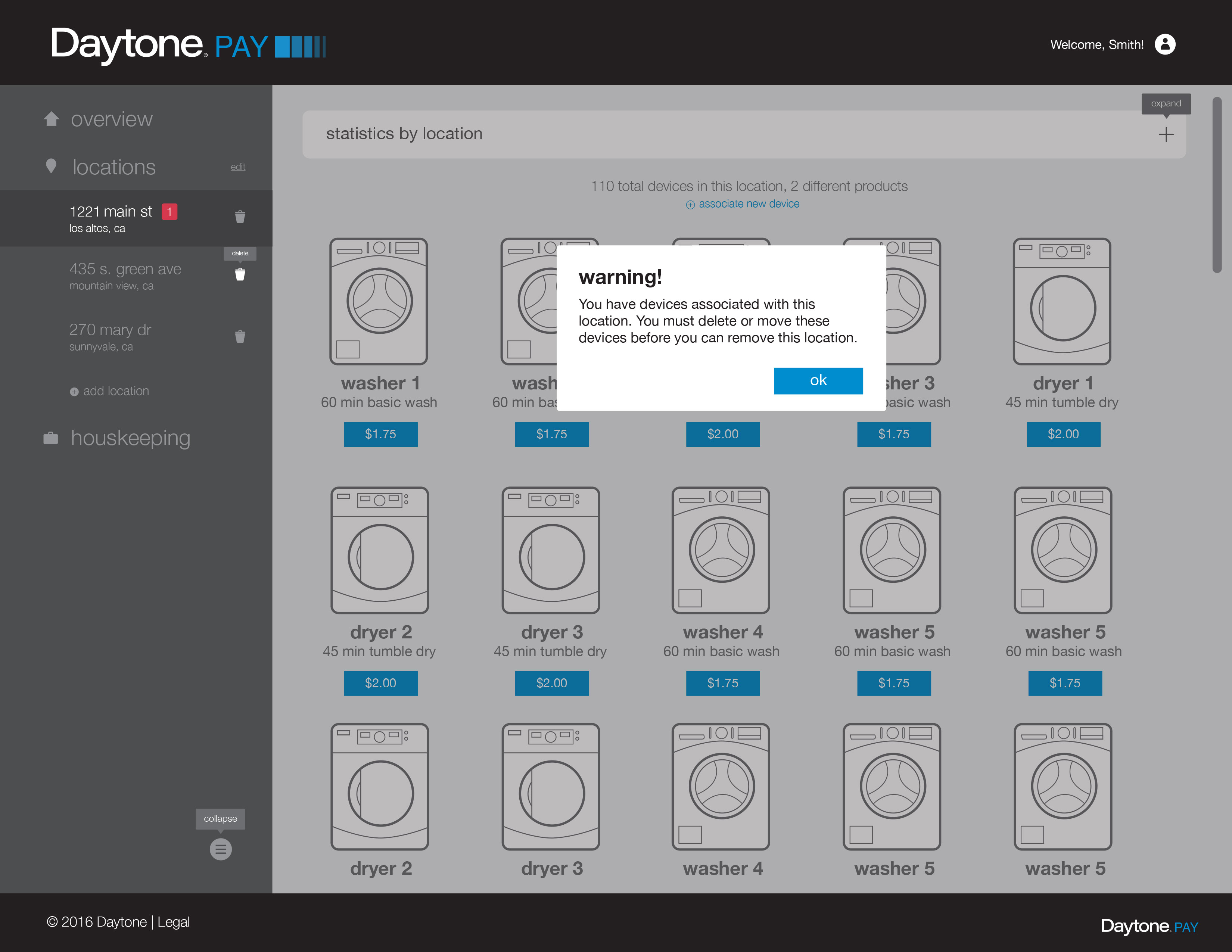
3. Modal dialog design: neutral color palette is maintained since the warning doesn't warrant an immediate CTA.
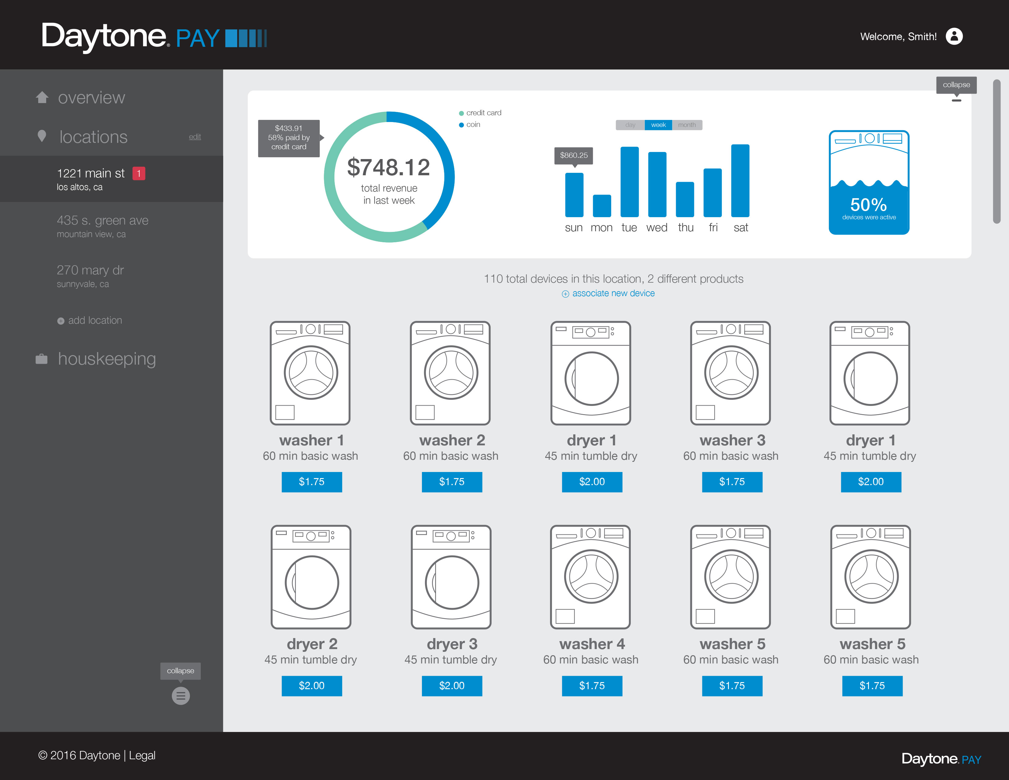
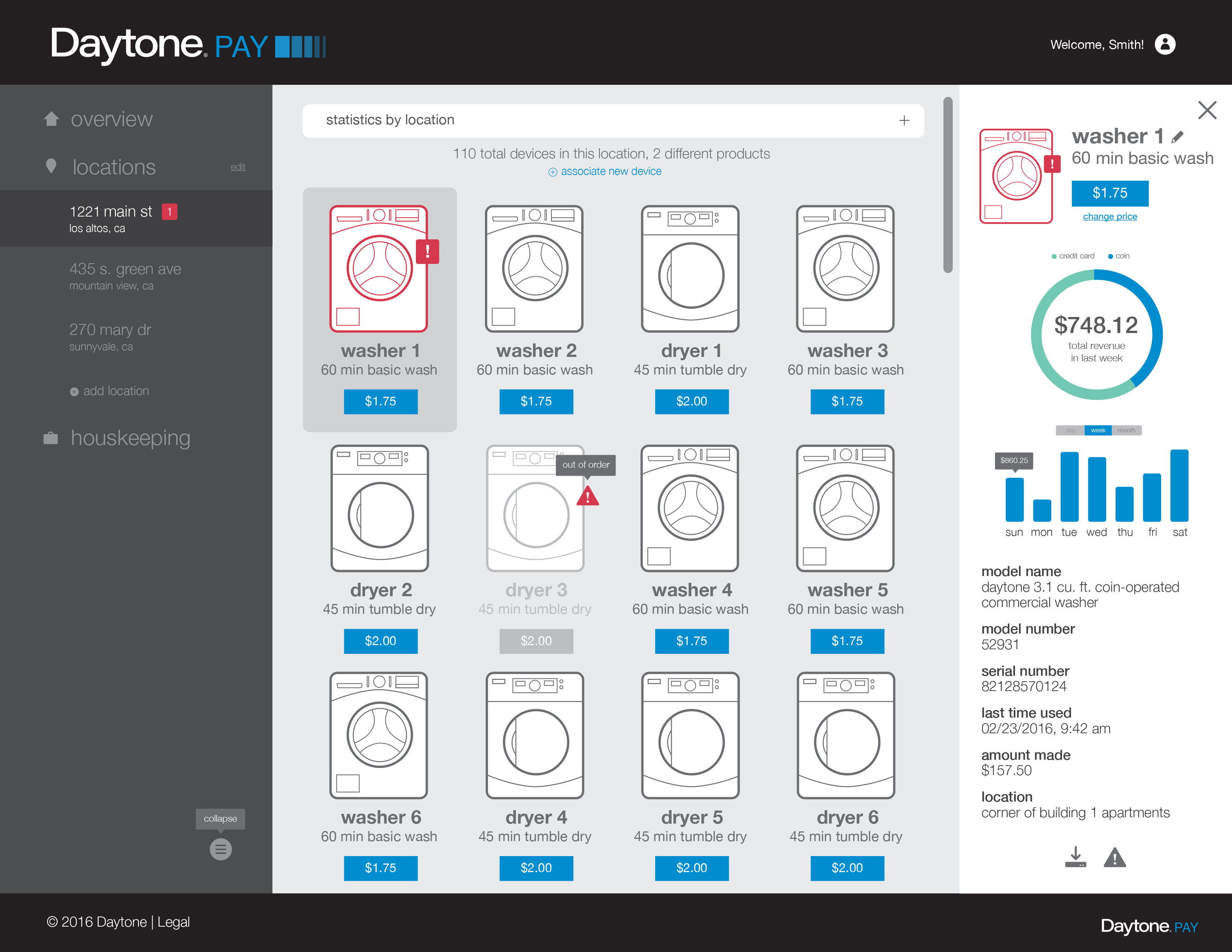
4. Collapsible statistics panel uses infographics to highlight key information, conveying data visually.
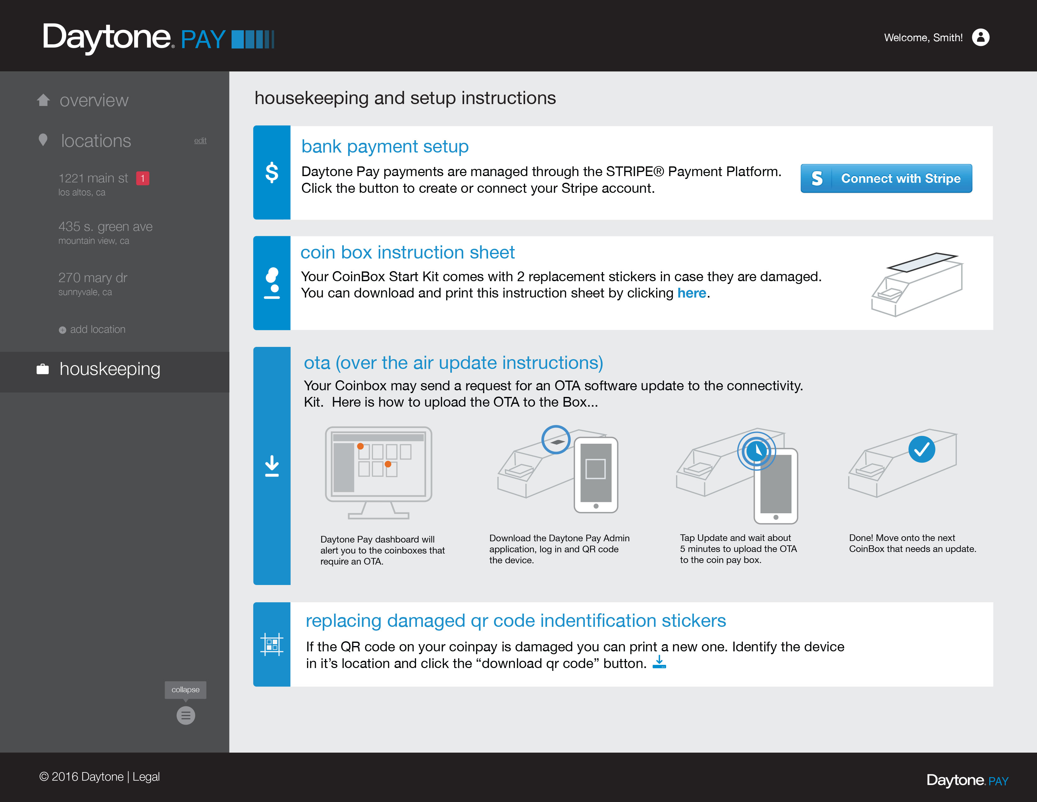
5. The Housekeeping tab is designed for users to access during their initial setup and for future reference. Located at the bottom, it serves as a convenient go-to resource.
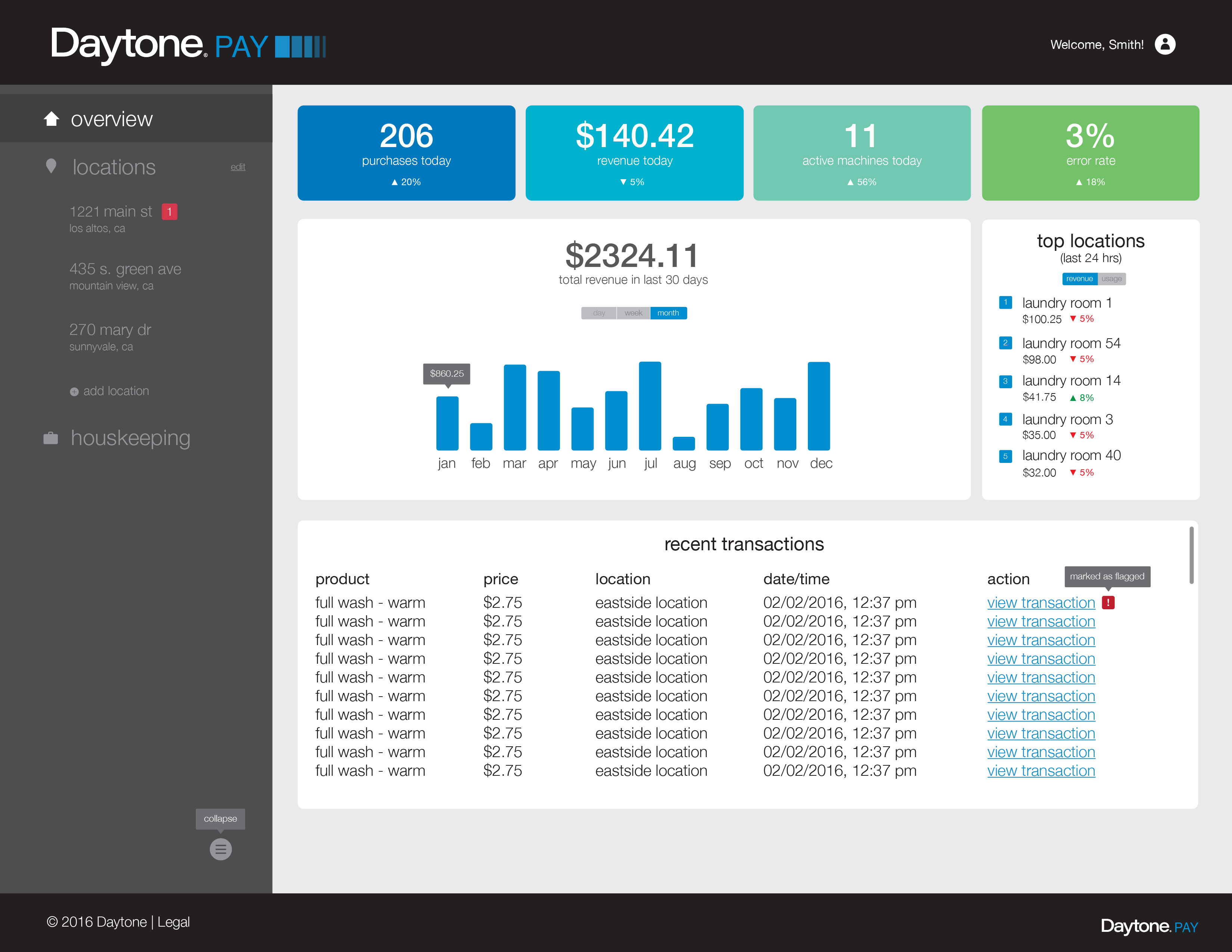
The bright and inviting colors welcome users to this initial dashboard after logging in. At a glance, users can view top-level statistics on their devices and drill down into specific locations and transactions.
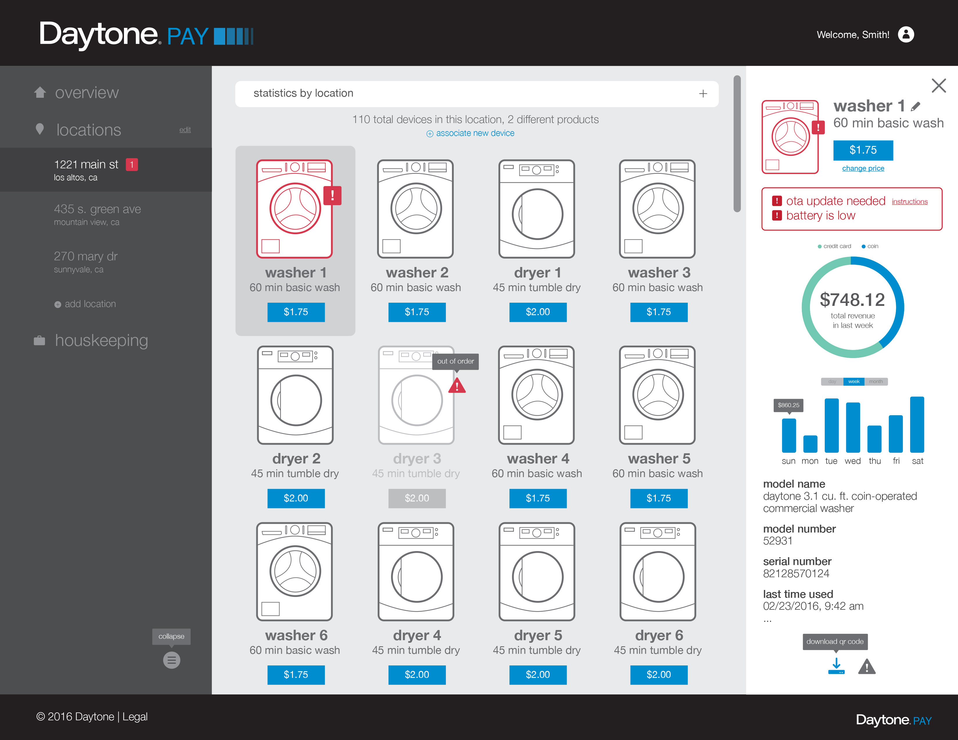
The prominent red color alerts users to washing machines that require maintenance. Specific error messages are progressively disclosed in the side panel.
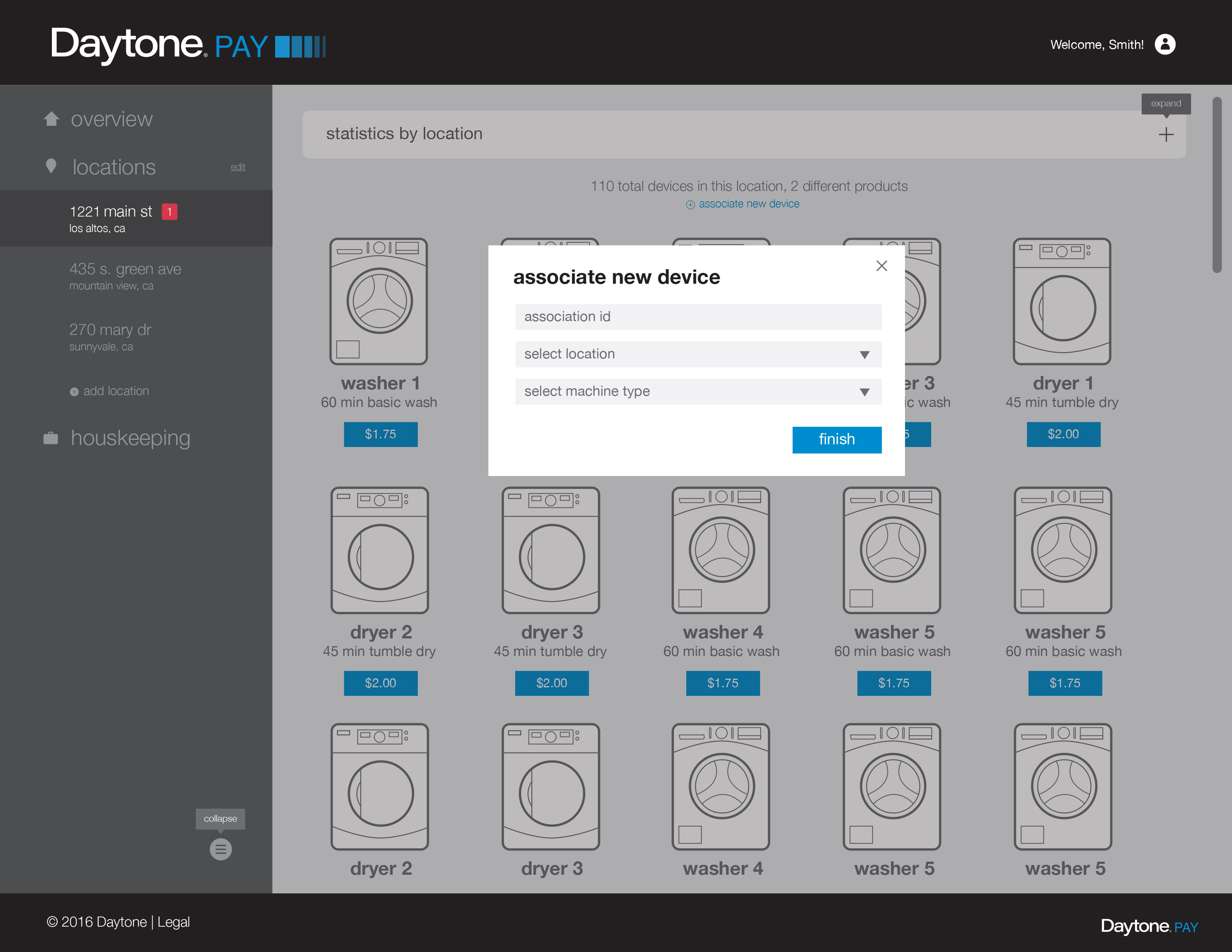
This modal appears when the "associate new device" link is clicked. The process is designed to be simple and straightforward.